


When we were first given this brief, I decided that I wanted to search for subjects and items that inspired and actually interested me. I wanted to use the blog as a means to record what I found captivating and, from there, hopefully it would help me realise what topics I would like to concentrate on for my dissertation and independent project. When we were asked to submit a Statement of Intent at the beginning of the summer, I had a few ideas, however no specific direction. I didn’t have a strong attraction to one subject, and I was hoping this brief would solve my problems!
In the beginning, I worked on this project intending to explore what was available and currently in the design industry, so as to increase my knowledge of our industry and hopefully improve as a designer. Yet, as I posted more blogs about varying subjects, my interest in all the creative genres grew. I’ve developed a taste for architecture, and have realised that I have a passion for photography and work that is “contrasting,” whether it’s thanks to, for example, the materials that have been used, or the surrounding area and the artwork. I am extremely glad that we were encouraged to explore all the genres as I feel I have also learnt and drawn inspiration from them.
Blogging about artists also helped me to realise that I myself don’t draw or paint any more. The blog has reminded me that my work doesn’t have to be purely created on screen, something that has somehow over the years turned into an assumption. Analysing work by the likes of Owen Phillips and Stephen Wiltshire has encouraged me to sketch again, and to incorporate this in my work as its an aspect that cannot be reproduced on screen.
I was determined to write about subjects that I felt passionate about, instead of blogging about anything to fulfill the brief. Otherwise, the blog would have been a completely pointless exercise. I looked for material in newspapers, both online and in print, other blogs, tv, design magazines and websites and the surrounding environment. I was always conscious of what was around me, in case there was a hidden gem. I now can’t even visit the shops for some milk without scanning the shelves, and I am unable to stop myself from analyzing any advertising, whether it’s on the side of a bus or during the adverts before a film at the cinema. I find myself dissecting the design, and then asking the following questions: Why have they used this direction? What is the message? An example would be the new Next advert, which is set entirely in Paris and then ends with a British website address. This reflects upon the style of my writing over the summer, developing from what I liked the look of to considering the direction and strategy.
One of the highlights of this brief was reading the blogs of my peers. It was interesting to read their views on the work they chose to blog about, and to understand a piece of work from a completely different angle to my own. Often they had noticed aspects that I had failed to spot, and it was enlightening to learn what interested them. I also discovered new things through their findings.
I thoroughly enjoyed this brief because it encouraged me to explore what creative work is already out there, enlightening me on what is possible, and I have begun to realise that, depending on your determination, there are no limits as to what you can achieve.
I have discovered many new sources of inspiration, which now fill my bookmarks menu, and I regularly check on a daily basis. I didn’t just find new inspiration; I also feel that my ability to recognise and critique design has also improved dramatically. I am now much more aware of the design that surrounds me. For example, I blogged about a book called the “Vintage fashion,” which was covered in a silk-like material, reflecting upon the contents of the book. The blog has not just improved my ability to understand the design around me, but has also benefited my own work. I believe I think much more about the impression it could give and, if possible, have become even more pedantic, which is slightly tiring but helping to improve my work!
At the start, I expressed my intention to use the blog as a tool to help me decide on a dissertation topic, which I have decided will be branding. As for the independent project, I am considering book cover designs, not just because of the threat of new technology, but also because I feel it is a forgotten medium of design.
I have become quite fond of my blog, and the phrase “I’m going to blog that!” is now familiar within my house. I’ve come to see my blog as a virtual scrapbook of inspiration, and I think I am going to continue adding to it.


Matt C Stokes is a designer and illustrator based in London. His clients include Unilever, Boxfresh, Dazed & Confused and Harper Collins. I was attracted to his work because of the instant impact it has upon the viewer: It’s bold and colourful, and he is capable of a variety of approaches.
Despite his website being slightly irritating, I could spend quite a long time flicking through his work. One of my favourites is the book design for “Pieces of Modesty” because of its simple and bold direction. I also admire the self-promotional “Fight Poster” thanks to the slightly feminine choice of colour contrasting with the masculine illustrations. The imagery is wonderfully detailed and the typography leaps off the page.

“Never Judge...?” will be a group exhibition taking place in December at the Stolenspace Gallery on Brick Lane, London. I am truly excited by this exhibition. The gallery has collaborated with Penguin books to present this celebration of book cover design, the title taken from the familiar phrase “Never judge a book by the cover.”
The exhibition will highlight the affect new technology, such as the iPad, could have upon books and the associated design. A variety of artists will be invited to produce their own book cover through any medium and for a book of their choice, as long as it is of the same dimensions as a Penguin book.
The concept for “Never Judge...?” is amazing. I love the idea of fighting against increasingly innovative technology for the traditional paperback, and it will be interesting to see how the selected artists will choose to voice their opinion. It’s also a reminder of how easily we sometimes dismiss book covers as a source of design. I honestly cannot wait for this exhibition to begin.

I’m currently reading “The Fundamentals of Branding” by Melissa Davis for my dissertation research, and I’m finding it incredibly interesting. It takes you through every aspect of branding, not necessarily in great detail, but enough so that the reader is left with a good understanding of the subject.
I’m especially enjoying the case studies because the book breaks down the brands of companies, such as Google and Pret A Manger, and explains the strategy behind their choices, both internally and in terms of design. The Fundamentals of Branding also includes case studies of brand agencies, for example, Interbrand and Saatchi & Saatchi. It was interesting to learn about their history, and the influence they have had upon the design industry.
The Fundamentals of Branding has helped me greatly with my dissertation research, and I am now even more interested in the topic. This is definitely a book you should have on your bookshelf.


Robyn Cumming is a photographer unlike any other that I’ve come across. In the biography on her website, she says: “Her work is inspired by human beings and how tragic, mundane and impossible our lives can often be.”
I found the series of images, entitled “Lady things,” fascinating. Thanks to the previously mentioned quote, I interpret the photographs as Cumming informing the viewer that women have no face, they are all the same and possess no personality. I also love her choice of props, highly detailed and feminine for what I believe is a strong, cold message (although I could be completely wrong...).
I don’t find Cumming’s work offensive, but thought provoking. I find myself trying to unlock the message hidden within her work.


The River and Rowing Museum in Henley-on-Thames is a fantastically complex building and was designed by David Chipperfield, who’s other work includes the Neues Museum, Berlin, and the Barcelona City of Justice.
This building attracted my attention firstly because of the mix of natural and modern materials: glass, concrete and wood. Chipperfield was inspired by the local boathouses and classic wooden barns, and he has maintained an element of their history. I greatly admire Chipperfield for choosing to do so.
Inside, the building is purely modern clad in concrete, yet it doesn’t feel clautrophobic or alien because Chipperfield has managed to make the museum feel spacious thanks to an open plan, spot lights and plenty of natural light. Through floor to ceiling windows the river and trees can be seen, and I love the contrast between the inside of the building and the surrounding area.

In my previous post, I mentioned the Brit Insurance Designs of the Year exhibition. I bought this year’s book and I absolutely love it. Normally, you’re just informed of the title of the work along with images from the exhibition, but this one includes the ‘blurb’ and concept and the judges comments, enabling you to see the two different sides, which in my opinion is just as interesting as the work itself. This little book has been a great source of inspiration, and I haven’t been able to put it down.
The cover design is another reason this is proving to be one of my favourite purchases. The different design sectors are debossed into the cover, and I admire how some are just cut off by the edge of the book. I love the contrast between the clean white stock and the subtle debossed finish against the shocking pink and bold type of the exhibition title. Love. It.
Over the summer, I visited for the first time this year’s Brit Insurance Designs of the Year exhibition at the London Design Museum. I really enjoyed it, I loved how there was work from all the different sectors of the design industry, and I found it really interesting to view the non-graphics work as it was fantastic to see what they were capable of.
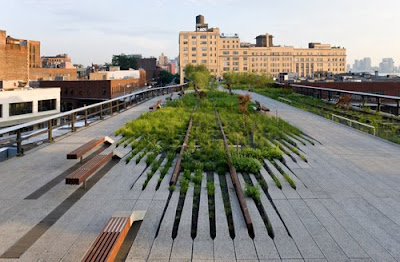
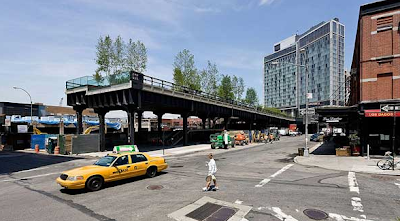

Entries came from all over the world and there was such an amazing selection to view. One of my favourites was High Line Park in the architecture category. Located in New York, High Line Park is 1.5miles long and built on a neglected elevated railroad. It was designed by James Corner Field Operations, a landscape architecture and urban design company and Diller Scofidio + Renfro, an architecture company. I love the idea of reenergising a previously abandoned and disused space, and I greatly admire the designers for maintaining what was left behind and adding a modern twist whilst blending in with the original foundations.
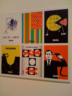
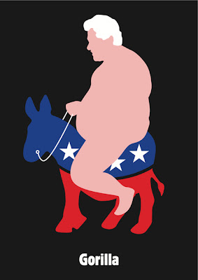
The Daily Visual Column for de Volkskrant by the Dutch Gorilla collective also caught my eye. Six times a week, they are allowed three hours to create a graphic related to the day’s news, which is then printed on the front of de Volkskrant, a Dutch newspaper. I was attracted to this entry partly because of the challenge of having to work under the pressure of a deadline nearly every day. I also admire the collective because their visuals are simple, bold and a tad cheeky. If de Volkskrant was available in England, I would buy it just for the tiny graphic in the corner, despite the fact I can only say 2 things in Dutch: "great" and "that tastes really nice."
I’d definitely recommend the Brit Insurance Designs of the Year exhibition, and it will without question become an annual trip for me.

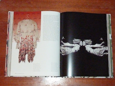

I was recently given a book about the history of fashion called, surprisingly, “Vintage fashion.” It may sound a bit boring, but actually it’s quite an interesting read, taking you from 1900 through to 1989, and is filled with delicate illustrations and photography.
The book highlights trends and explains changes in fashion design, and the affect cultural and social influences had upon the fashion industry. As you flick through the book, it’s fascinating to see how fashion has changed dramatically over the years, and there really have been some horrific trends. Vintage fashion also discusses famous designers, such as Coco Chanel and Elsa Schiaparelli, revealing their background and fashion history, and explains their rise to fame.
I especially admire the cover as the designer has gone one step further and covered the book with a silk-like material giving it a beautiful smooth touch. From the beginning the reader is influenced, and you feel like you should handle the book with care. The foil-blocked title is the final nice touch.

I love the website: the space has been used in a simple way that I’ve surprisingly never seen before, and I like how the imagery has been simplified through silhouettes, but still has lovely detail. I also admire the restrained use of colour, suitable I suppose for the theme. The press page however is my favourite, it’s a great method to interest the reader instead of the usual list of links you find on some websites.
The chosen typeface is a bit disappointing, and I wish something could have been done to avoid the white space between the tunnel and videos. Perhaps it could have been made black, and then a white line could have been added for the edge of the tunnel, but this is probably just me being pedantic.
I would love to go to one of the events, perhaps New Years Eve...


Rietveld Landscape were asked by the Netherlands architecture institute to raise awareness of the high number of empty public buildings in the country, which have “enormous potential and the government are failing to make use of.” Over the summer I coincidentally visited the Netherlands for the first time, and they have so many beautiful buildings, so it’s a shame to learn that some are potentially not being used.
The result is Vacant NL: an installation that “calls upon the Dutch government to make use of the enormous potential of inspiring, temporarily unoccupied buildings from the 17th, 18th, 19th, 20th and 21st centuries for innovation within the creative knowledge economy.”
The installation features in the Dutch Pavillion at this year’s Architecture Biennale in Venice. It is formed of over 1,000 small, blue foam model buildings, one for each empty building in the country. Every single model is suspended from the double-height ceiling of the pavilion. A book was also provided with the details of each building, and I adore the idea of the audience being able to locate them if they so wished.
The scale of the installation looks fantastic and quite imposing; I wish I could see it in person. I love the idea of being able to walk under the models and view it from above as well. I also admire the choice of colour and the decision to use only one for the models; I believe it has helped to intensify the lost and forgotten aspect of the situation.