Wednesday 29 September 2010

Ping


'Ping' is the latest feature for iTunes. How is it different?

Ping allows you to follow friends and artists, and to discover more about them. Profiles can be personalised with a biography, status updates, the person’s location, posting videos and photos, sharing music they like, what concerts they are going to next… Does any of this sound familiar? If you still aren’t too sure, the Ping tagline should clarify things: Introducing Ping. A social network for music.

I found it really interesting that iTunes are entering the social market. Is it because they have seen the success of Twitter and Facebook, and have therefore decided to try and incorporate some of the aspects from these two particular social networks into Ping? Or is social networking becoming a normal form of communication? It even has its own Recent Activity feed, very similar to Facebook. I also wonder if iTunes are trying to compete with Spotify – do they regard them as a strong competitor?

I think it’s a shame that Apple used many features similar to other social networks. It would have been nice if Apple had created an element, which was completely new and differentiated Ping. Being the creators of the iMac, iPod and iPhone, I just expected more. A part of me also wishes that Apple had continued the “i” trend, but then again iPing doesn’t sound quite right…

Tuesday 21 September 2010

Virgin trains

A few days ago, I travelled to Manchester by Virgin trains. It was my first time with Virgin, never having flown with them either.

My previous preconception of the Virgin brand was fun, new and going the extra length. I’ve always had the impression that Richard Branson’s company was a bit quirky and often entering new markets.

I loved the modern design of the trains. The exterior was sleek and subtle. For once, it was nice to see a train that wasn’t overpowering with its branding unlike a certain red, orange and blue competitor…

The interior seemed to be designed for your comfort. Tables folded inwards so you could easily access window seats. Shutters could be pulled down to thwart glaring sunlight and reading lights were available.

Lights in the baggage holders above the seats reflect upon the ceiling, and spotlights run down throughout the centre of the carriages. At every entrance, blue neon lights on walls greet you. Seat details were all electrical, none of those bits of paper poking out of seat tops. Colour is subtly used on the inside too, and everything is curved: the front of the train’s exterior, the corners of the windows, the edges of the seats, the sloping shape of the baggage holder. Design has clearly been a major factor. I felt that Branson wanted to make train transport more of an experience.

Currently, there are Virgin Media, Virgin Atlantic, Virgin Limobike, Virgin Money, Virgin Wines, Virgin Life Care, Virgin Festivals… The list is endless, and I can’t help thinking, how has Branson succeeded? Entering new markets is always daunting, and involves communication and organisation problems as your company grows in size.

I’m fascinated by the branding of companies, and am considering it for my dissertation, so Virgin would be an ideal candidate. Richard branson has moved his company into so many markets, all under the one brand. Amazing.

Monday 20 September 2010

NY vs UK


Whilst at the National Portrait Gallery for the BP Portrait Award, I also visited “An Englishman in New York: Photographs by Jason Bell.” A small collection of Bell’s photographs were on display from his latest book (of the same title).

During an American Vogue project in 2008, Bell learnt that more than 120,000 Britons have settled in New York. This discovery motivated him to explore further, and this book is the outcome.

Well-known British figures who have left Britain for a life in New York formed part of the photographs on show, for example, Kate Winslet. However, in the book, there is also a range of characters including taxi drivers, burlesque dancers and UN ambassadors.

I adored the photographs. Still and contrasting, although a bit staged, I loved the figures and locations. Each photograph revealed a new side to New York and the person posing for Bell. I also admired the angle and the variety of ways Bell has chosen to take the photographs - sometimes straight on, through a window or from an extreme angle. In each picture, I felt that it was equally about the person and the chosen location in New York.

The captions for the photos were just as interesting. Each person shared why they chose to live in New York, and whether there was a particular aspect of Britain that they missed. Their personal accounts tempted me to move to New York, but also made me very patriotic for England.


Sunday 19 September 2010

Death and disrespect in art


Portraits are my favourite type of art: I love to study the faces and expressions. So, not surprisingly, the BP Portrait Award at the National Portrait Gallery is one of my favourite annual exhibitions.

A variety of styles and subjects is always guaranteed and, often, some of the paintings are so realistic that you suspect they are photographs. The individuals featured in the paintings range from the artists’ families to well-known figures like Boris Johnson and Theo Pathitis.

This year’s collection was different to previous exhibitions. I felt some pieces were darker and there was much more symbolism, which unfortunately I’m not a great fan of.

“Geneva”
by Ilaria Rosselli del Turco portrays professional dancer, Geneva Rosett-Hafter, and “was inspired by Italian Renaissance profile portraits, where the head is placed following geometrical principles.” The painting particularly caught my eye because of del Turco’s bold use of colour. The style is quite loose, softening the image, yet the painting is still detailed and refined.

My reaction to the winner, “Last Portrait of Mother”
by Daphne Todd, was mixed. I studied the painting before reading the information, and quite admired the variants in tones and shadow. The woman looked in pain.

I then read the information and discovered that the painting showed Todd’s mother, 100-year-old Annie Mary Todd, as she lay in a refrigerated room in a funeral parlour. Todd was given her mother’s permission to paint her after she passed away, and studied her body for three days.

I was stunned. Todd described the painting as "a devotional study," but my immediate reaction was that it was disrespectful. The painting disturbed me. I wondered how Todd could have studied her mother’s body for so long, and if this is how far artists will go to differentiate themselves and be original? Would Todd still have won if her mother had instead been sleeping?

Germany's greatest gothic cathedral


I recently visited Cologne, where one of the must-see tourist attractions is the city's cathedral. Known as Germany's greatest gothic cathedral, it took over 600 years to construct and was completed in 1880 with a national celebration.

Despite the fact that it was pouring with rain when I visited, the cathedral was stunning. I spent a long time standing outside under my umbrella, amazed by its size and the impact that the cathedral created. I was constantly spotting new details everywhere: water pouring through the mouths of gargoyles, rows of detailed sculptures around the double doors, a gold bishop... The level of detail was brilliant.

Inside, the ceiling was unbelievably high and statues adorned the walls as you walked passed. The lighting seemed to purposefully spotlight certain sculptures and it was just dark enough for the candles to make an impression.

If you ever find yourself in Cologne, the cathedral is definitely not to be missed.

Saturday 18 September 2010

Not the usual Hollywood blockbuster


Shutter Island is not the usual Hollywood blockbuster. Directed by Martin Scorsese, this psychological thriller is insanely intriguing. It’s the type of film which could confuse you, so it’s advisable to pay attention! Nevertheless, it’s worth it.

Leonardo DiCaprio plays Edward "Teddy" Daniels, a U.S. Marshal who is investigating the disappearance of a patient from an island psychiatric facility. The story line wasn’t at all what I expected, with a surprising twist at the end. Little is given away and, as the film continued, my curiosity just kept growing.

The film flicks between reality and Daniels’s imagination, nightmares and past. Unlike other films, Scorsese has managed to slip in these scenes without interrupting the story. They are particularly powerful and surreal; the effects are fantastic and so convincing that I felt uncomfortable.

Sounds play a large part. Music helps to set the tone, increasing the suspense. I especially liked the parts where only footsteps or the character’s breathing could be heard over the music. I also found it refreshing how Daniels, the main character is not typically strong. He’s scared, haunted by his past and by the death of his wife. The reason for this apparent weakness is revealed towards the end.

Scorsese shot the film in such a way that it plays on the perspective and disorientates the audience. At one point, the characters are seen from the floor and, during another scene, there are fast close-ups mixed with sound clips.

I would definitely recommend Shutter Island, not just for the unusual plot but also for the style of filming.

Friday 10 September 2010

Information is beautiful


'Information is beautiful' is a quirky book by David McCandless. It’s filled with his exploration of how to make information more accessible after realizing that we are swamped by it every day. He came to the conclusion that “…we’re all visual now. Every day, every hour, maybe even every minute, we’re looking and absorbing information via the web.”

McCandless set out to explore how to visualise information and ideas using both old and new methods, with the aim of making the results “approachable and beautiful.” The subjects are ones he found interesting and wanted to discover more about but, instead of relaying facts and figures, he decided to concentrate “…on the relationship between facts, the context, the connections that make information meaningful.”

The result is fantastic. Every page is impactful and dynamic. McCandless has filled them with shapes, silhouettes and amusing illustrations and thoughts, yet it’s still organised and easy to take in. Colour, typefaces and space have been skillfully used to break up the layout resulting in engaging diagrams. The subjects are fantastic, ranging from “Types of facial hair” to “Internet Virals.”

I admire McCandless because there is an unbelievable variety of ideas, each one different to the one before it. His use of colour and layout could be helpful towards my dissertation, as I’m also considering these two topics for my dissertation.

'Information is beautiful' is an amusing read and a great source of inspiration. I would definitely recommend it to anyone.

Wednesday 8 September 2010

The world I want to live in


James Cameron is a genius. I missed Avatar the first time it came out, so I was ridiculously excited when it was recently re-released. I’ve just come back from the IMAX in London and I was blown away by the film.

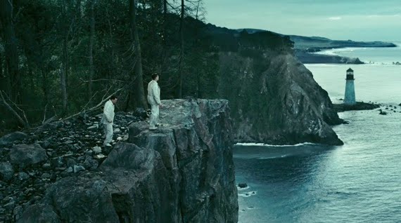
From the very beginning, you are visually bombarded with stunning scenes. Pandora, the world belonging to the Na'vi, the blue aliens, is truly amazing.

It’s the colours which first take your breath away. Water and plant life are fantastically bright and they glow in the dark. There was one scene where the main character, Jake Sully, is captivated by a large clump of glowing coral-coloured flowers. He reaches out to stroke one and it quickly retracts into its shell, so he tries to touch another and soon sets off a chain, and all the flowers in the patch hide away. It was a beautiful and touching scene and I could feel Sully’s amazement and shared it with him.

Another feature I loved, not just because of the forest’s beauty, occurred when the characters were running. Whether it was on a tree branch or the forest floor, where their feet landed the surrounding area would glow a beautiful bright colour. I was constantly amazed by the interaction between nature and the Na'vi.

It was these little details that added something else to the film. The soft, hypnotic movement of the seeds from the sacred tree. Subtle shadows fall on the Na'vi from nearby trees and the bright spots on their faces are like glowing embers. Everything looks so delicate and has been created with great detail.

I wasn’t just amazed by Cameron’s portrayal of Pandora, but also by his visualisation of future human technology. Another of my favourite scenes was one of the first, when Sully is awoken from an induced coma, along with thousands of others each in their own capsule. Thousands of rows of capsules can be seen and it’s remarkably believable like everything else in the film. The 3D effects made Avatar incredibly realistic, drawing you further into the story and didn’t at all help my vertigo.

I found the contrast in the portrayal of the two races intriguing: the humans are violent and devious, whilst the Na'vi are harmonious and peaceful. I felt this was reflected in each race’s environment: the humans surrounded by machinery and bland, dark colours whilst the Na’vi live in a colourful, naturally magical world.

Despite the fact the plot may not be the most original, this really is an amazing film. I can’t express how much I admire Cameron for the dedication he has shown in producing Avatar. His attention to detail working with scientists, illustrators and linguistic experts to create his own world and language for the Na'vi all prove that Cameron is the ultimate perfectionist.

In every scene, it’s hard to focus on one aspect as there’s so much to take in and study. Not once did my attention waver, and I honestly cannot wait to see what Cameron comes up with in the sequel. Thank goodness there are two more films on the way!

Wednesday 1 September 2010

The city in ink


I am not ashamed to say that my daily work commute pleasure is reading The Metro and The London Evening Standard. As I was flicking past articles about Boris and Tiger Woods, I came across a beautiful hand-drawn sketch of London. It made me remember that an impressive image doesn’t have to be created by computer alone.

The ink drawing was by autistic Biritsh artist, Stephen Wiltshire, who has the amazing ability to rapidly draw and paint engaging lifelike city landscapes after viewing them for only a short period of time. From his work, you can tell that he appreciates both old and new architecture, and I admire this as someone who fears that modern architecture, nice as it is, is taking over.

I prefer Wiltshire’s line drawings to his paintings and coloured drawings. The line drawings really emphasize the clear, bold structure of the architecture. Wiltshire’s work is incredibly detailed and he presents the modern skyscrapers with an elegance that rivals Saint Paul’s.

Wiltshire has reminded me about the power hand-drawn images can have, and their potential for use within design. I will be dabbling with charcoal once again very soon…