Showing posts with label exhibition. Show all posts

Wednesday, 27 October 2010

“Never Judge...?”

“Never Judge...?” will be a group exhibition taking place in December at the Stolenspace Gallery on Brick Lane, London. I am truly excited by this exhibition. The gallery has collaborated with Penguin books to present this celebration of book cover design, the title taken from the familiar phrase “Never judge a book by the cover.”

The exhibition will highlight the affect new technology, such as the iPad, could have upon books and the associated design. A variety of artists will be invited to produce their own book cover through any medium and for a book of their choice, as long as it is of the same dimensions as a Penguin book.

The concept for “Never Judge...?” is amazing. I love the idea of fighting against increasingly innovative technology for the traditional paperback, and it will be interesting to see how the selected artists will choose to voice their opinion. It’s also a reminder of how easily we sometimes dismiss book covers as a source of design. I honestly cannot wait for this exhibition to begin.


Tuesday, 26 October 2010

Brit Insurance Designs of the Year


Over the summer, I visited for the first time this year’s Brit Insurance Designs of the Year exhibition at the London Design Museum. I really enjoyed it, I loved how there was work from all the different sectors of the design industry, and I found it really interesting to view the non-graphics work as it was fantastic to see what they were capable of.


Entries came from all over the world and there was such an amazing selection to view. One of my favourites was High Line Park in the architecture category. Located in New York, High Line Park is 1.5miles long and built on a neglected elevated railroad. It was designed by James Corner Field Operations, a landscape architecture and urban design company and Diller Scofidio + Renfro, an architecture company. I love the idea of reenergising a previously abandoned and disused space, and I greatly admire the designers for maintaining what was left behind and adding a modern twist whilst blending in with the original foundations.

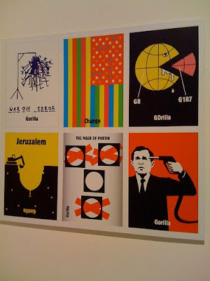
The Daily Visual Column for de Volkskrant by the Dutch Gorilla collective also caught my eye. Six times a week, they are allowed three hours to create a graphic related to the day’s news, which is then printed on the front of de Volkskrant, a Dutch newspaper. I was attracted to this entry partly because of the challenge of having to work under the pressure of a deadline nearly every day. I also admire the collective because their visuals are simple, bold and a tad cheeky. If de Volkskrant was available in England, I would buy it just for the tiny graphic in the corner, despite the fact I can only say 2 things in Dutch: "great" and "that tastes really nice."

I’d definitely recommend the Brit Insurance Designs of the Year exhibition, and it will without question become an annual trip for me.


Monday, 25 October 2010

Sargent and the Sea


During the summer, I visited the Royal Academy of Arts to see the “Sargent and the Sea” exhibition featuring work by John Singer Sargent.

Sargent is a well-known American portrait artist, however this exhibition revealed a completely new side to Sargent as a successful marine painter. From just glancing at some of the pieces, you could tell that Sargent was fascinated by everything connected to the sea. His work covered a wide range of subjects, locations and styles, and whether it was a large canvas or a sketch in a notebook, he always used precise, delicate detail.

It may not interest everyone, but I adored this exhibition, especially the vivid colours, Sargent's ability to recreate movement and light on canvas, his attention to detail and his obvious passion for his work.

Monday, 20 September 2010

NY vs UK


Whilst at the National Portrait Gallery for the BP Portrait Award, I also visited “An Englishman in New York: Photographs by Jason Bell.” A small collection of Bell’s photographs were on display from his latest book (of the same title).

During an American Vogue project in 2008, Bell learnt that more than 120,000 Britons have settled in New York. This discovery motivated him to explore further, and this book is the outcome.

Well-known British figures who have left Britain for a life in New York formed part of the photographs on show, for example, Kate Winslet. However, in the book, there is also a range of characters including taxi drivers, burlesque dancers and UN ambassadors.

I adored the photographs. Still and contrasting, although a bit staged, I loved the figures and locations. Each photograph revealed a new side to New York and the person posing for Bell. I also admired the angle and the variety of ways Bell has chosen to take the photographs - sometimes straight on, through a window or from an extreme angle. In each picture, I felt that it was equally about the person and the chosen location in New York.

The captions for the photos were just as interesting. Each person shared why they chose to live in New York, and whether there was a particular aspect of Britain that they missed. Their personal accounts tempted me to move to New York, but also made me very patriotic for England.


Sunday, 19 September 2010

Death and disrespect in art


Portraits are my favourite type of art: I love to study the faces and expressions. So, not surprisingly, the BP Portrait Award at the National Portrait Gallery is one of my favourite annual exhibitions.

A variety of styles and subjects is always guaranteed and, often, some of the paintings are so realistic that you suspect they are photographs. The individuals featured in the paintings range from the artists’ families to well-known figures like Boris Johnson and Theo Pathitis.

This year’s collection was different to previous exhibitions. I felt some pieces were darker and there was much more symbolism, which unfortunately I’m not a great fan of.

“Geneva”
by Ilaria Rosselli del Turco portrays professional dancer, Geneva Rosett-Hafter, and “was inspired by Italian Renaissance profile portraits, where the head is placed following geometrical principles.” The painting particularly caught my eye because of del Turco’s bold use of colour. The style is quite loose, softening the image, yet the painting is still detailed and refined.

My reaction to the winner, “Last Portrait of Mother”
by Daphne Todd, was mixed. I studied the painting before reading the information, and quite admired the variants in tones and shadow. The woman looked in pain.

I then read the information and discovered that the painting showed Todd’s mother, 100-year-old Annie Mary Todd, as she lay in a refrigerated room in a funeral parlour. Todd was given her mother’s permission to paint her after she passed away, and studied her body for three days.

I was stunned. Todd described the painting as "a devotional study," but my immediate reaction was that it was disrespectful. The painting disturbed me. I wondered how Todd could have studied her mother’s body for so long, and if this is how far artists will go to differentiate themselves and be original? Would Todd still have won if her mother had instead been sleeping?