Universal wrapping paper by Fabio Milito, Francesca Guidotti.
Friday, 8 April 2011
Saturday, 12 February 2011
How to play with printers
Making a common product fun.
This video was created by Matt Robinson and Tom Wrigglesworth in response to a D&AD Student Awards brief set by Hewlett Packard: "Present an idea which promotes HP Workstations ability to bring to life anything the creative mind can conceive."
Tuesday, 11 January 2011
A must: Letterheady


So much time could be lost on this site. The range is unbelievable, from a single line on the page (Saul Bass can afford to) to unusually large illustrations. I especially adore how some of the designers have playfully used the space, ignoring the conventional.
This site is a must.

Monday, 27 December 2010
Hel Looks


I admire that there is no dominant genre, anything goes, and each person has the opportunity to give an opinion - their 5 minutes of fame you could say.
I love the feel of the website, how the latest entry is the homepage. I also like how the website is simply black and white, therefore focusing your attention on the featured people. No gender or age group is favoured, anyone can be chosen.
It would be fantastic if the website could expand, go global [probably impossible...], so that you could explore and compare the different cultures and fashion trends of each nationality.
I think the reason I like this site so much is because I feel that it gives the public a chance to be the centre of attention. Unlike gossip blogs and established magazine websites, Hel Looks celebrates the unknown individuals fashion and looks to the public for inspiration.


Thursday, 9 December 2010
Monday, 6 December 2010
Disney affection
The 50th promotion video made me realise that Disney is one of those brands that the audience have an emotional attachment to. They instantly take you back to your childhood. When you see one of their films, you connect it to a memory or an emotion. Evidence of an amazing brand.
Saturday, 4 December 2010
The Book Cover Archive

I love looking through the pages and being able to see all the covers together and compare them. It's interesting to see how different designers have approached the media.
Definitely one to add to your favourites...

Sunday, 21 November 2010
Soulwax
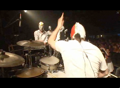
The website for Soulwax instantly makes me want to go out. It consists of paired up clips from their events, but also interviews, installations and random footage. I love the full screen video and how it controls what you view as well as highlighting some questionable dance moves...
Wednesday, 10 November 2010
Road art


"Roadsworth" initially started graffitiing the streets in 2001 to campaign for more bike paths in Montreal, but now his passion has evolved...I am totally appreciating how he/she has manipulated the space to their advantage.
I also like this statement from their website:
"Though maybe not purely altruistic, there is an awareness that the interest of others could also be in ones own interest. Big words for a vandal."
Subscribe to:
Comments (Atom)


